Logos
A logo is the foundation of a brand’s identity. My logo work focuses on creating distinctive, versatile marks that communicate a brand’s personality while remaining timeless and functional across digital and print applications.

Original logo by client; I enhanced it with a wink effect to bring additional texture and personality.
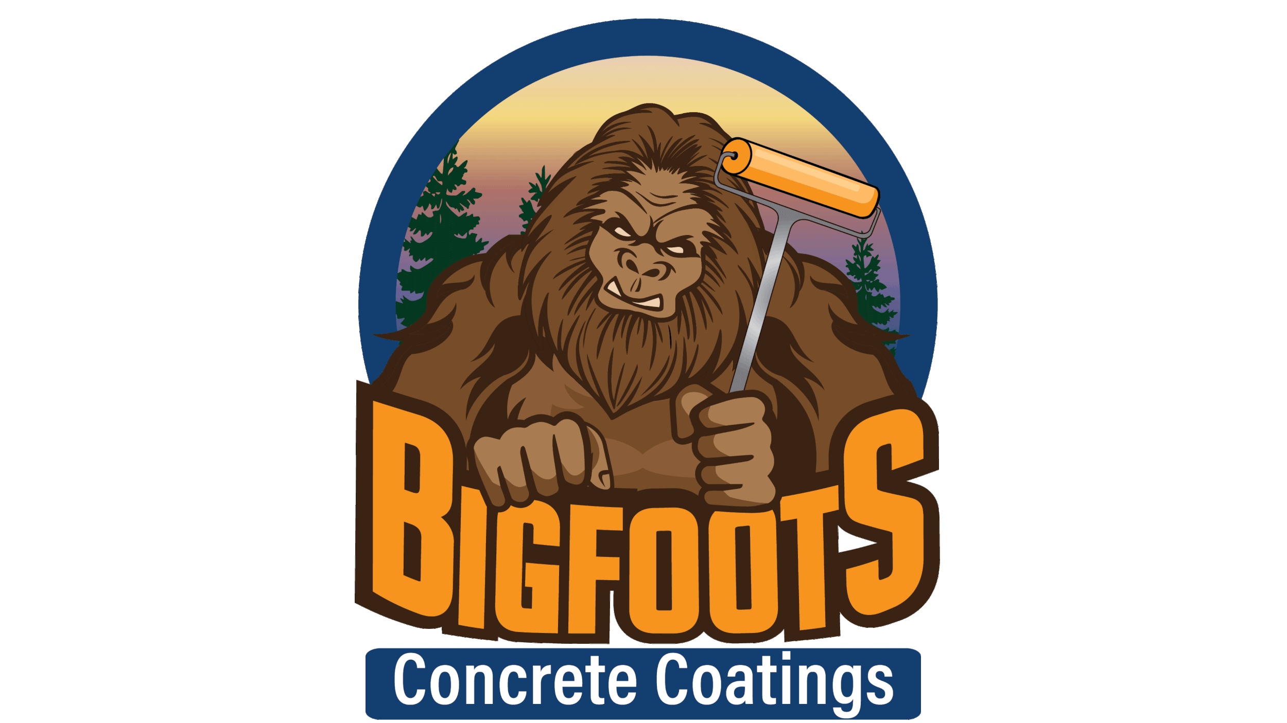
The Bigfoots Concrete Coatings logo features a friendly Bigfoot holding a concrete coating tool. In the animated version, he blinks and stomps the tool, adding personality and energy that makes the brand memorable and engaging.


Original logo by client; I enhanced it with a wink effect and drip coming from the plunger to bring additional texture and personality.
A complementary brand mark created to maintain visual cohesion with DelMetro Inc. while standing independently.
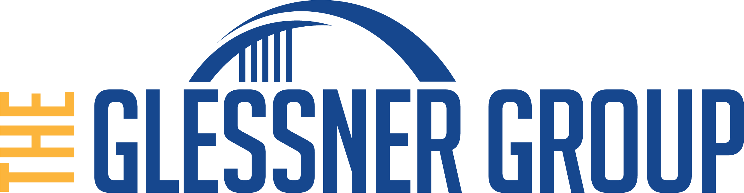
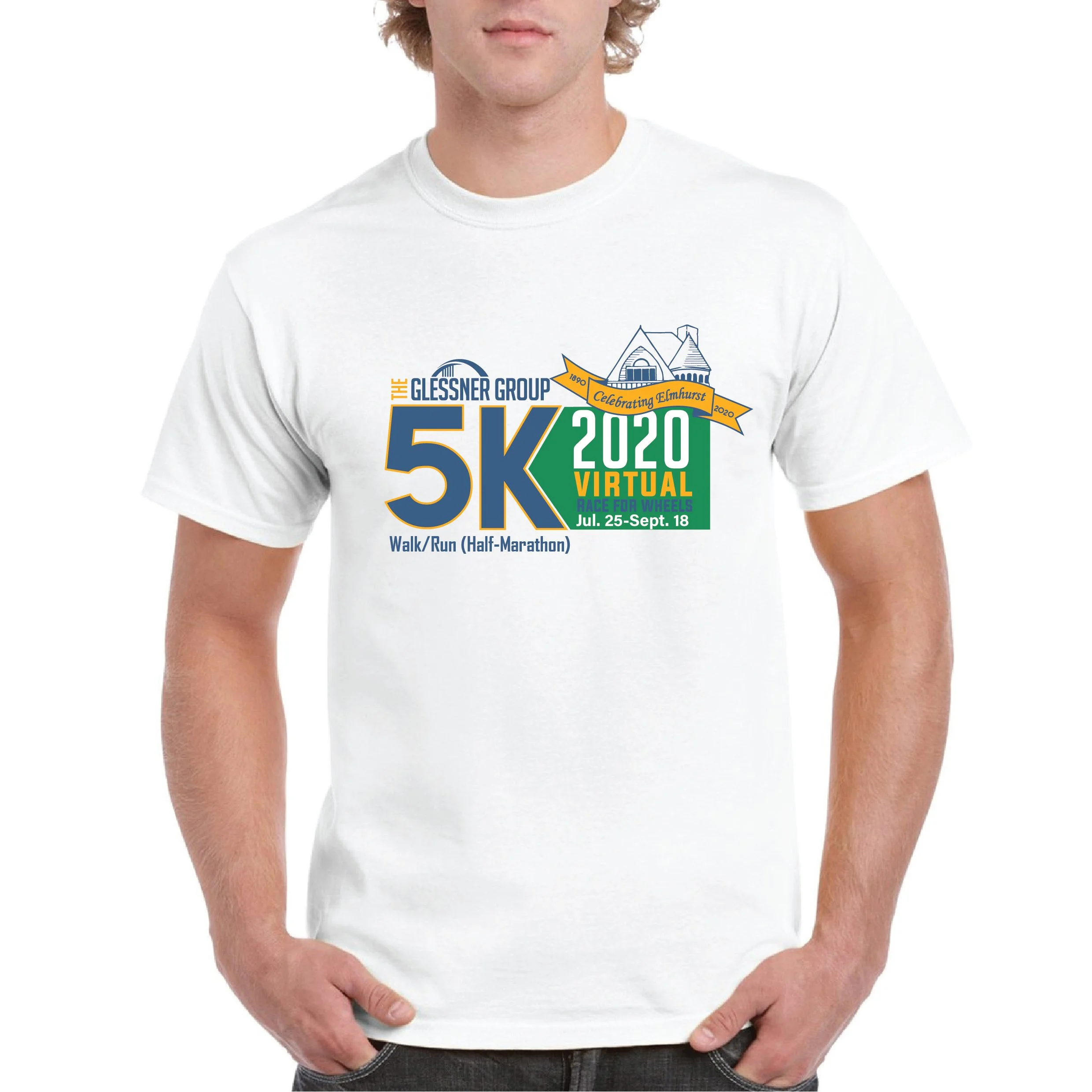
Upon joining The Glessner Group, my first initiative was to develop and unify the brand identity across all affiliated businesses. I created a clean, structured logo featuring a bridge to symbolize strength and leadership, with five bars beneath representing the group’s companies: Glessner & Associates, Glessner Wharton Andrews Insurance, Glessner Snodgrass Wealth Management, BBC&F Insurance, and Don Wild & Gold Insurance. The final design reflects unity, stability, and a strong foundation across all divisions.
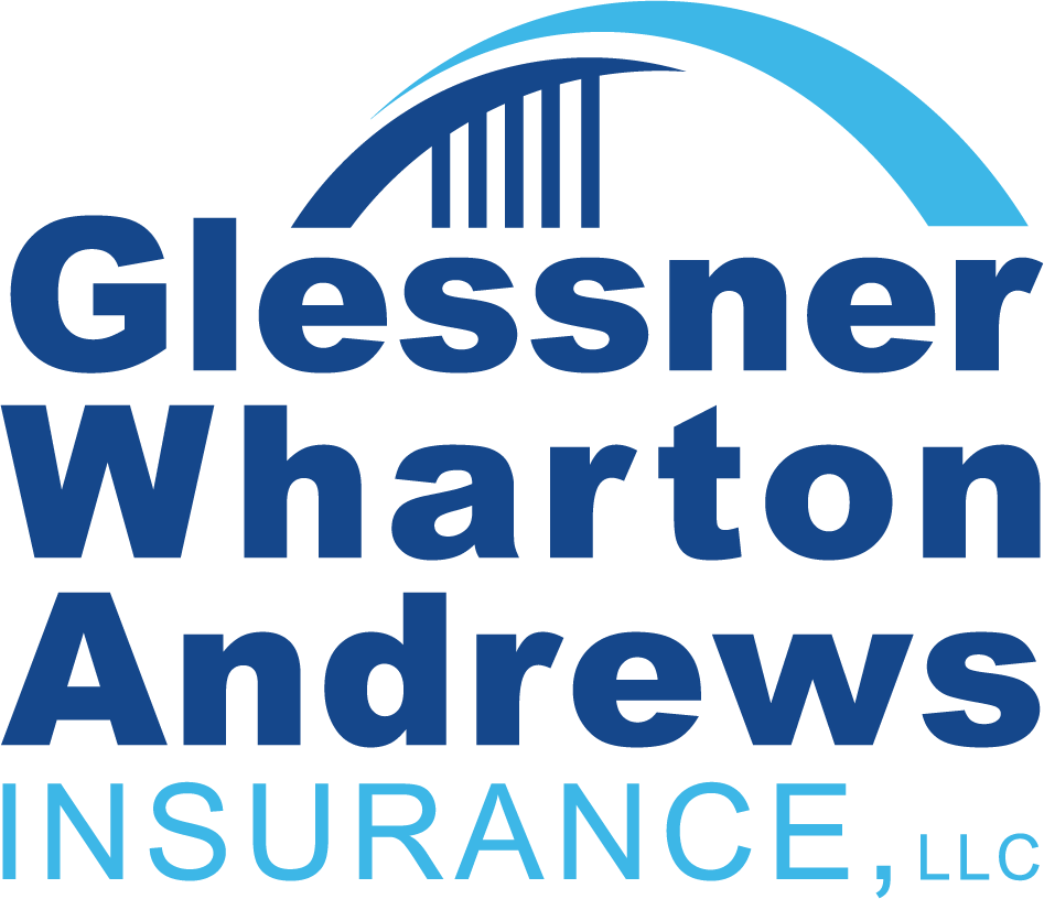
This version utilizes light blue and the signature Glessner blue, reinforcing professionalism and dependability while maintaining visual cohesion across all divisions.
A clean, professional extension of the unified bridge mark, representing strength and leadership within the group. This variation features a blue and yellow palette, blending trust and energy while maintaining the signature Glessner blue.
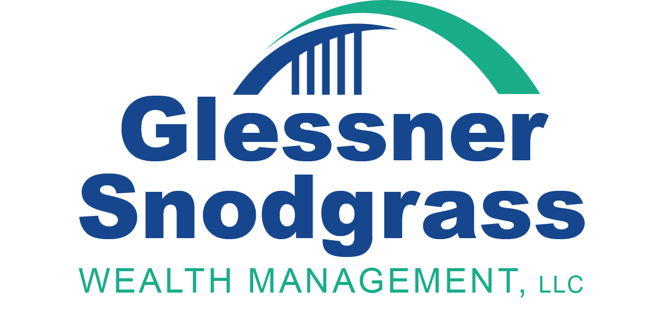
Designed to reflect growth and financial stability, this logo features a greenish teal and blue palette, symbolizing prosperity within the unified brand framework.
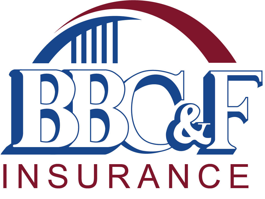
Built from the same cohesive brand system, this version incorporates maroon and blue, creating a strong, established presence while remaining aligned with the overall identity.
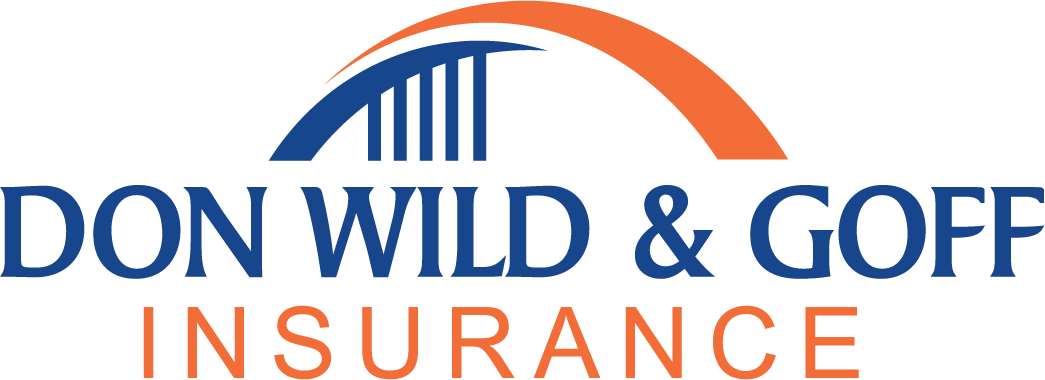
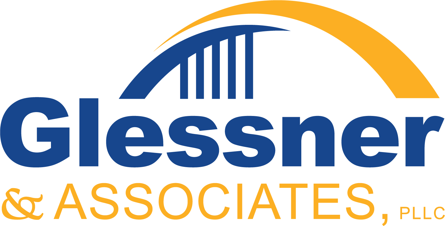
This variation uses orange and blue, adding warmth and approachability while preserving the structural consistency of the master brand.

A clean, modern logo designed to visually connect Evolve to its affiliated company, Glessner Group. The design incorporates the same bridge as the Glessner Group logo, but without the supporting bars that resemble branches. This subtle adaptation maintains brand cohesion while giving Evolve its own independent identity.